In other news: Trump doesn’t want Greenland anymore…
Nah, he will just call the map “DEI”.
Actually, 164 to 1 countries voted in favour of the new projection, the one opposing vote was from the USA.
Trump property thought we really were making the world smaller.
Nah his admin is on about reviving the great western civilization of the 16th century, godless anti colonial uprising causing iits decline and “radical ideological projects” like that Mercator UN vote bahaha
Can’t get picky if you’re an orange.
Watch out, UN. My idiot president is gonna get mad.
To be fair, that’s his resting state.
This is true proportional/scaled size. I’m sure Russia is bigger than an inch wide as it’s displayed on my screen
I’m sure Russia is bigger than an inch wide
That’s just what the US Military Industrial Complex want you to believe!
pff. that’s tankie revisionist current eventstory
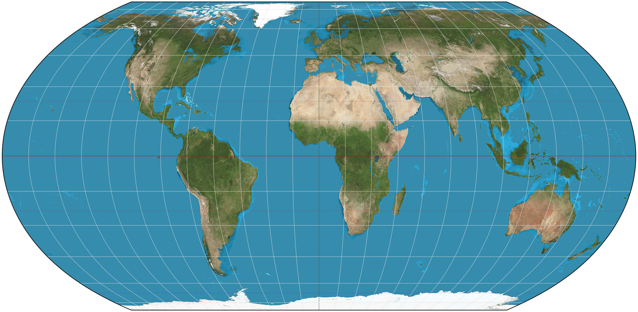
All world maps are inaccurate except a globe. Equal Earth still shows distortions when you move closer to the poles. Instead of stretching along the latitude it now compresses along the longitude
How about Dymaxion

So where’s Antarctica on this map?
Penguins aren’t real, you fool!
Dymaxian is a pretty good one for showing sizes, useless for navigation though
um, okay but this specific distortion is unhelpful to me. it just shows the extent of the distortion, not what the new map would be. the new map is the most pertinent piece of info.
I’m kinda surprised there weren’t tons of countries against this. For its faults in representing size the Mercator projection is great at representing direction (that’s what it was intended for after all). For Japan, New Zealand, and even Austrailia this places North at really awkward angles, making what are in reality straight lines appear curved. If anything, this is even more euro centric than the Mercator projection due to the amount of straight line distortion applied being longitude dependent, centered around Europe. I’d also expect Russia to be against it since it makes them look smaller, even if they don’t have the same distortion problem as countries directly opposite Western Europe.
The projection should have been changed, but it should be a a compromise projection like Robinson or Winkel Tripel that doesn’t perfectly preserve area, distance, shape, or direction, but also doesn’t horribly distort any of them.
making what are in reality straight lines appear curved.
Totally unheard of before.
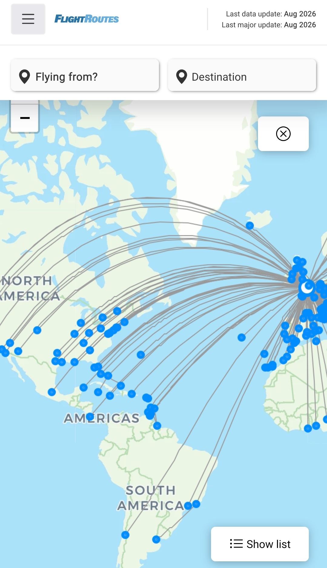
Yes but with the Mercator projection the distortion is not dependent on longitude, only latitude. So for any given arc changing the longitude of both endpoints equally simply moves the arc without altering its shape. Adding distortion with longitude in addition to the already present distortion with latitude doesn’t exactly make the problem any better in my opinion, as the arc now depends on an extra variable. With modern tech it’s pretty surprising they don’t just use a globe in UIs everywhere, but equal earth although good for representing size is just bad for directions. The grids cities are built on usually orient North/South, but for cities on the edge these become diagonal lines in the equal earth projection. Basically equal earth requires a choice of either accepting that all grids will no longer be oriented toward North on maps or dynamically adjusting the top of the map’s viewport to point North.
I’m sure that was high on the list of demands for African counties, kept in a debt trap and exploited.
Best we can offer is changing a map.
Is that why they all voted Yes for this at the UN?
How will we deal with the spaces between the countries that will form? Especially the one under Russia
What is shown is just an online tool for showing true continent size. This is the equal earth projection, and you’ve probably already seen it in schools:
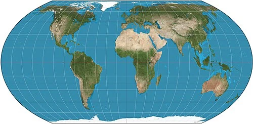
That’s an equal area projection, and I hate that they named it Equal Earth when there’s many ways to skin that cat. There are many ways to do equal area projections, such as Albers, Lambert, Mollweide, and more.
https://en.wikipedia.org/wiki/Equal-area_projection
They really should use the Winkel Tripel. It’s a fantastic compromise projection that doesn’t perfectly preserve anything (area, shape, size, and direction), but also doesn’t horribly distort anything except for the shape of Antarctica.
Oo this one is nice
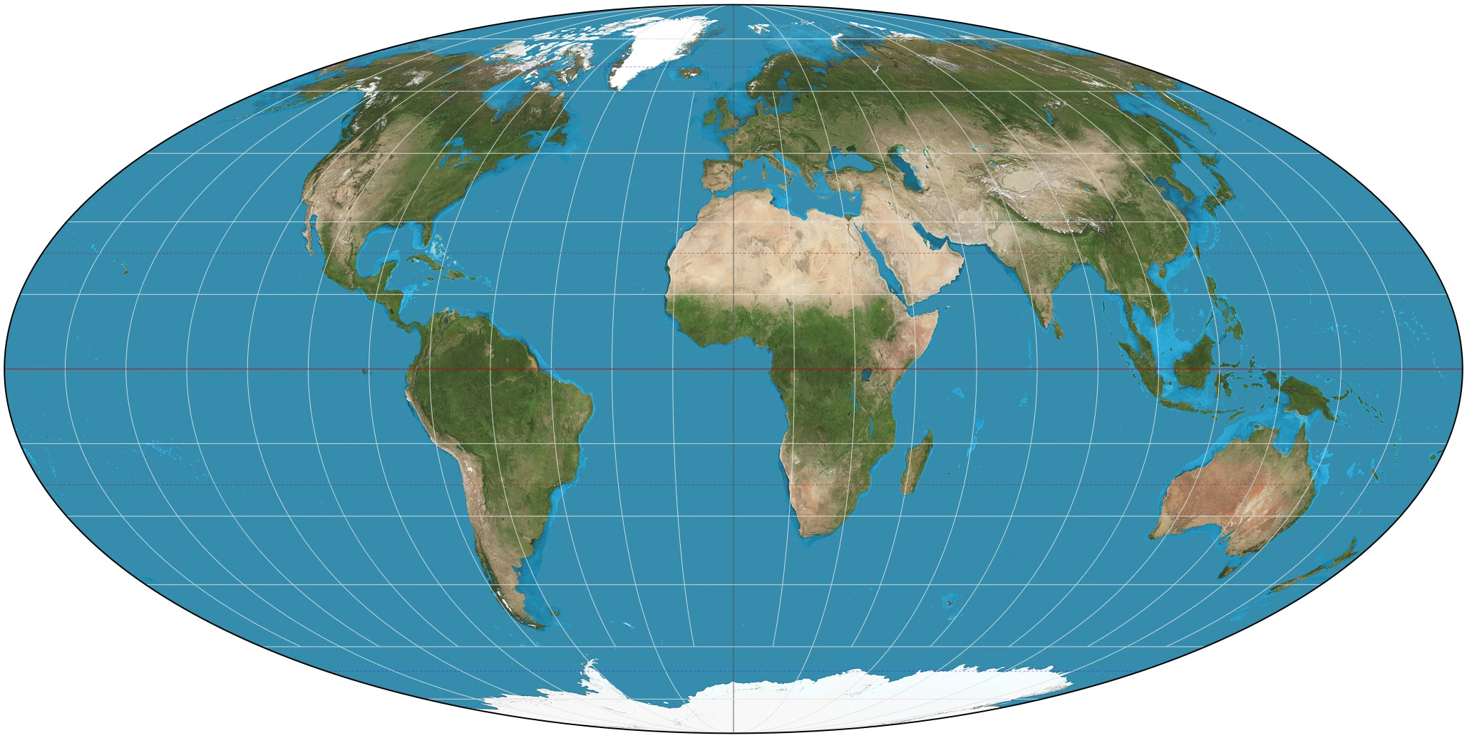
Oh god, I think I’m in love:
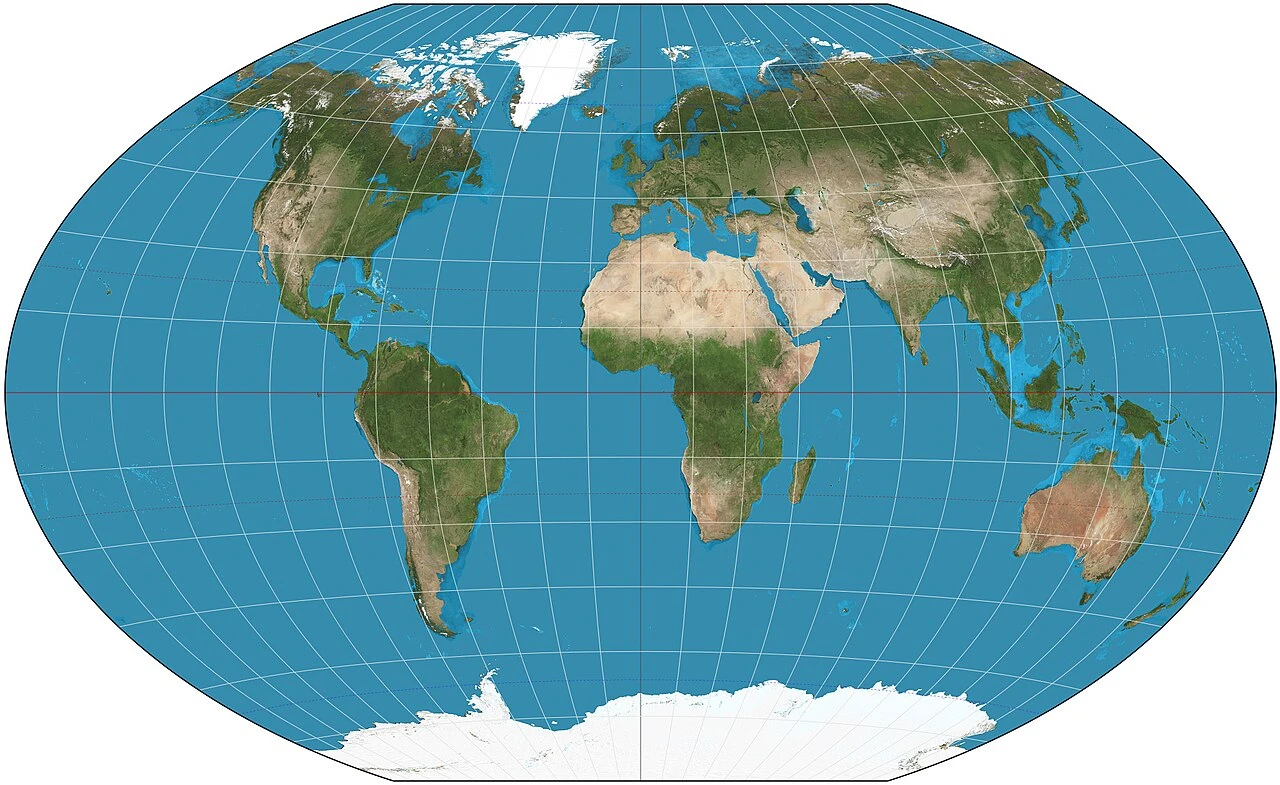
Duh, bridges.
Do nothing. We are happy to see Russia going far away from the Finland.
Lol
We call the Dutch, they’ll fill it up.
Gekoloniseerd!
Woo hoo! I’m going to hike across Siberia now. It is so small.
I don’t believe you
This is going to piss off flat earthers. “What projection?”
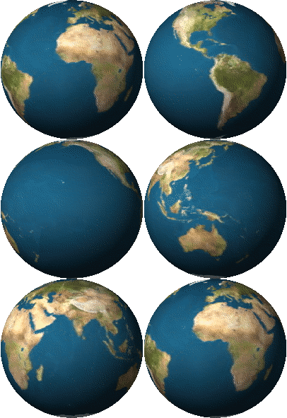
3D surfaces refuse to play well with 2D projections.
Hahaha, Russia 🤏
I like the one what looks like a pealed orange personally
It always blows my mind that the US and China are the exact same size. +/- ~15000km2
(i.e. Northern Ireland + China == US)Right? Close enough that it changes depending on territorial water claims and disputes.
Heh
I feel like I’ve been lied to even though I knew about the mercater projection.
It’s because you have been lied to.
Fair