arotrios@lemmy.world to Political Memes@lemmy.worldEnglish · 12 days agoIran the numbersimagemessage-square36linkfedilinkarrow-up1259arrow-down13
arrow-up1256arrow-down1imageIran the numbersarotrios@lemmy.world to Political Memes@lemmy.worldEnglish · 12 days agomessage-square36linkfedilink
minus-squareTRBoom@lemmy.ziplinkfedilinkarrow-up47arrow-down1·12 days agoSo at first glance this chart looked a little odd… some of the colors were wrong for the northeast and then I saw some more states shaded incorrectly. SO I went and found the original. I think https://www.visualcapitalist.com/mapped-gas-prices-since-the-iran-war-state-by-state/
minus-squarenocturne@slrpnk.netlinkfedilinkarrow-up14·12 days agoIf nothing else, your version has more pixels. Thank you.
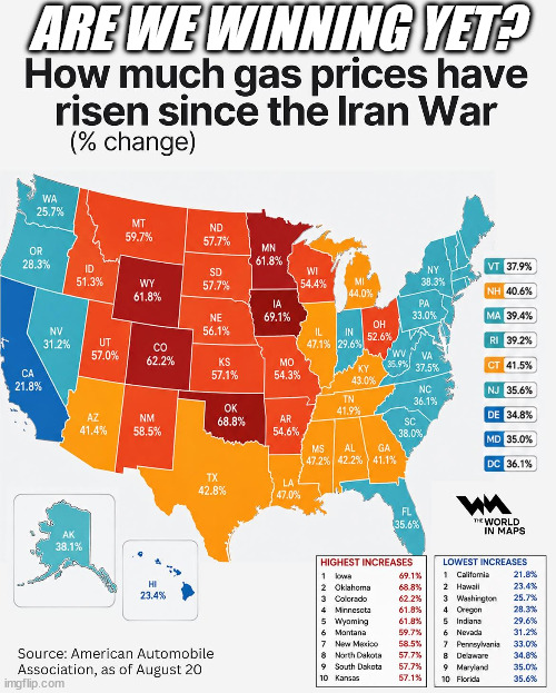
So at first glance this chart looked a little odd… some of the colors were wrong for the northeast and then I saw some more states shaded incorrectly.
SO I went and found the original. I think
https://www.visualcapitalist.com/mapped-gas-prices-since-the-iran-war-state-by-state/
If nothing else, your version has more pixels. Thank you.