This is not a SFW instance. NSFW communities will be tagged, and efforts will be made to keep SFW communities clean, but proceed at your own comfort level.
Not just the logo design but the design of the actual signs themselves, just the fact that they’re actual 3D things rather than a flat sheet makes it sooooo much more appealing.
Having one or two 80’s style signs like the RICOH one is actually a really nice aesthetic IMO, seen it in a couple places and it creates a kind of… calm big city vibe
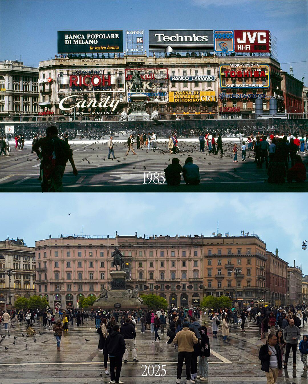
I kind of dig it with all the ads. Like aesthetics wise. Just looks like a plain old building now. Just my opinion though.
I think you may just be enjoying classic logo design.
Not just the logo design but the design of the actual signs themselves, just the fact that they’re actual 3D things rather than a flat sheet makes it sooooo much more appealing.
Having one or two 80’s style signs like the RICOH one is actually a really nice aesthetic IMO, seen it in a couple places and it creates a kind of… calm big city vibe
Yea… Groovy.
That’s quite possible. If it was covered in those video screen billboards we have today I probably wouldn’t like it.