This is not a SFW instance. NSFW communities will be tagged, and efforts will be made to keep SFW communities clean, but proceed at your own comfort level.
This is why, if I want to upload an image that needs a circle drawing attention to some part of it, I use blue instead of red. Useless red circles become even more useless when someone struggles to see red, but the most common forms of color-blindness show a distinction for blue.
I have an app on my phone that simulates different types of color blindness (Chromatic Vision Simulator, or CVSimulator. Free, no ads, it just does the thing it’s designed to do.) Sometimes I use it to make art that can be accessible for people without a full range of color perception, or to make something that is designed specifically for them. Sometimes such limitations encourage creativity, and if it means more people can enjoy a piece, I’m all for it.
I will mention this becomes quite messy sometimes. But simpler charts absolutely. Line thickness and lightness can also be used but a surprising amount of software has insufficient rendering capability for these.
Yes a lot of software is absolute shit at support for the color blind or visually impaired. Even so called “508 compliant” applications are a joke. We validate our software where I work, and certify it to be 508 compliant since we have government customers. But it’s a complete joke. Just a formality and afterthought. Anyone actually trying to use it with accessibility tools would have a hell of a bad time. One reason I prefer Linux is the desktop and most apps tend to be a lot more configurable than other OSes. Which allows you more control over color and font size.
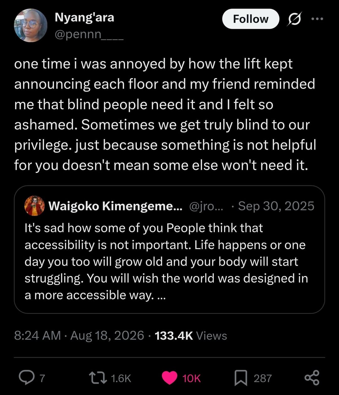
This is why, if I want to upload an image that needs a circle drawing attention to some part of it, I use blue instead of red. Useless red circles become even more useless when someone struggles to see red, but the most common forms of color-blindness show a distinction for blue.
I have an app on my phone that simulates different types of color blindness (Chromatic Vision Simulator, or CVSimulator. Free, no ads, it just does the thing it’s designed to do.) Sometimes I use it to make art that can be accessible for people without a full range of color perception, or to make something that is designed specifically for them. Sometimes such limitations encourage creativity, and if it means more people can enjoy a piece, I’m all for it.
Don’t use color, use different line types. Hatching, cross hatching, zig zag, dotted line, dashed line.
Great advice! That sounds like a fun way to add character to an art piece too.
I will mention this becomes quite messy sometimes. But simpler charts absolutely. Line thickness and lightness can also be used but a surprising amount of software has insufficient rendering capability for these.
Yes a lot of software is absolute shit at support for the color blind or visually impaired. Even so called “508 compliant” applications are a joke. We validate our software where I work, and certify it to be 508 compliant since we have government customers. But it’s a complete joke. Just a formality and afterthought. Anyone actually trying to use it with accessibility tools would have a hell of a bad time. One reason I prefer Linux is the desktop and most apps tend to be a lot more configurable than other OSes. Which allows you more control over color and font size.
Interesting, what is the app called?
Its name is Chromatic Vision Simulator, or “CVSimulator.”